
Flowbite
Flowbite is an open-source UI component library built with Tailwind CSS, offering easy setup, dark mode support, and a comprehensive design system for rapid prototyping.
Flowbite Introduction
Flowbite is an open-source UI component library built on Tailwind CSS, designed to simplify the process of creating web interfaces. It offers over 56 types of elements, such as buttons, navbars, modals, and more advanced ones like datepickers. What makes Flowbite notable is its integration with the utility-first Tailwind CSS framework, ensuring components are easy to customize without hidden complexities. Features include built-in dark mode, RTL support, and responsive design. The WYSIWYG editor stands out, allowing content editing with minimal setup. For anyone looking to streamline their Tailwind CSS projects, Flowbite is a handy tool that balances flexibility and ease of use, much like having a Swiss Army knife for web design.
Flowbite Key Features
Easy Setup & Integration
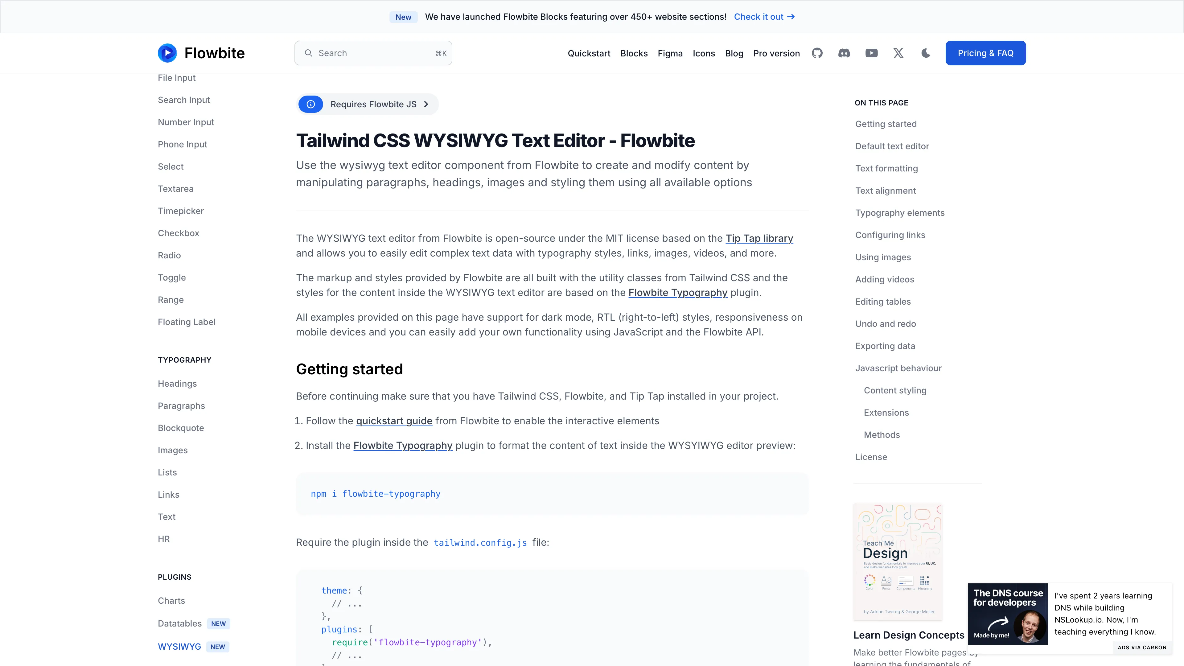
Flowbite stands out with its simplicity in setup and integration. Just install Tailwind CSS and Flowbite, use some CDN links for JavaScript, and copy-paste the HTML and JS code to get a fully functional WYSIWYG editor. It's like plug-and-play for your web projects.
Comprehensive UI Components
Flowbite offers over 56 UI components such as buttons, alerts, dropdowns, and navbars, built with Tailwind CSS and vanilla JavaScript. Think of it as the Swiss Army knife of web design, providing everything needed for quick prototyping and development.
Responsive & Mobile-First Design
Every component in Flowbite is designed with a mobile-first mentality, ensuring responsiveness across all devices. It's like having a personal assistant making sure your site looks great on any screen size, from smartphones to desktops.
Extensive Figma Support
Flowbite's components are designed first in Figma, allowing designers to prototype before coding. Paired with Tailwind CSS, this approach facilitates smoother transitions from design to development, saving time and aligning visions.
Open-Source Flexibility & Customization
Being open-source, Flowbite allows deep customization and easy edits with visible code, without hidden complexities. Imagine building with Lego blocks where every piece is visible and adjustable, giving you total control over your project's look and feel.
Flowbite Use Cases
Quick Prototyping for Startups: A startup team looking to rapidly prototype their new web application uses Flowbite to easily integrate responsive buttons, dropdowns, and modals. By leveraging Flowbite’s pre-built Tailwind CSS components, they save valuable time and focus on functionality, accelerating their product’s time-to-market.
Content Management for Blogging Sites: A blogger wanting to enhance their site’s UX integrates Flowbite’s WYSIWYG text editor. This allows for seamless editing of text, images, and videos directly within their Tailwind CSS-styled application, improving the user experience and content delivery without extra hassle.
Dark Mode and RTL Support for Global Apps: A development team working on a global application uses Flowbite’s built-in dark mode and RTL (right-to-left) support. This ensures their UI is accessible and visually appealing to users from diverse regions, accommodating different language scripts effortlessly.
E-commerce Platform Development: An e-commerce developer quickly adds product listings and user interaction elements like pagination and alerts using Flowbite’s ready-to-use components. This streamlines the process of building a robust, interactive e-commerce site, enhancing customer engagement and sales.
Mobile-First Design for Small Businesses: A small business owner uses Flowbite’s mobile-first design components to create a responsive, visually appealing website. The utility classes from Tailwind CSS combined with Flowbite ensure their site looks great on any device, attracting and retaining more mobile users.
Flowbite User Guides
Step 1: Install Tailwind CSS and Flowbite in your project.
Step 2: Use CDN links for Tailwind CSS and Flowbite if you prefer a simpler setup.
Step 3: Copy-paste the HTML and JavaScript code from Flowbite's examples into your project.
Step 4: Customize text, images, and other elements using Tailwind CSS utility classes.
Step 5: Leverage Flowbite's pre-built UI components to enhance your webpage, like buttons and modals.
Flowbite Frequently Asked Questions
Flowbite Website Analytics
- India14.9%
- Indonesia7.2%
- United States6.6%
- Vietnam4.5%
- Pakistan3.6%
Flowbite Alternatives
Agentplace lets you create AI-powered websites and apps with dynamic interfaces and voice interaction, all without coding. Simply describe your vision in text, and launch instantly.

AgentQL is an AI-powered tool for robust data extraction and web automation, using natural language for reliable element identification, even as websites change.
Allapi.ai offers seamless API integration, simplifying complex processes for developers and enhancing productivity with user-friendly tools.
Augment UI uses AI to quickly prototype frontend designs, allowing you to generate and edit code directly in the browser for seamless development.
Blackbox AI is an advanced coding assistant that boosts developer productivity with features like code autocomplete, generation, error optimization, and version tracking.
bolt.new lets you create, edit, and deploy full-stack web apps directly in your browser without writing code, offering real-time debugging and full development environment support.